Wickham's XHTML & CSS tutorial
Sitemap |
Home |
Search
Two and three column layouts
View in Firefox, Safari, Opera and IE but IE6 often needs different solutions. In general IE7 and IE8 display like Firefox apart from the HTML5 and CSS3 features. The IE9 & above updates are mainly related to HTML 5 and CSS3 issues and display to a large extent like other main browsers. Google Chrome is based on the same WebKit engine as Safari.
Some of the examples are provided just to show problems, others show solutions that work in most major browsers. Use the example that suits you.
 problems
  warning: works in some situations or some browsers or needs care to display as you wish
  OK in Firefox, Safari, Opera, Google Chrome and IE
Divs with fixed widths in px
The following examples are in a centered page containing div width: 730px;
1 Left and right divs are floated
float: left; width: 240px; background-color: pink; overall width 248px including 2*3px padding and 2*1px border
more text
float: right; width: 474px; background-color: yellow;
730px-240-borders 4*1-padding 4*3 = 474px
2 Left div floated; right div no float and no width. If these examples were not in a fixed width containing div the yellow div would expand and contract for any window resolution.
float: left; width: 240px; background-color: pink; overall width 248px including 2*3px padding and 2*1px border
background-color: yellow; (no float and no width defined);
more text
more text
more text
more text
Text will wrap under left div. (It needs a full line height to start wrapping)
The reverse of the above example with the fixed width div on the right. The pink right div must be coded first so that the yellow div with no width or float will move up into the space and surround the pink div.
float: right; width: 240px; background-color: pink; overall width 248px including 2*3px padding and 2*1px border
background-color: yellow; (no float and no width defined);
more text
more text
more text
more text
Text will wrap under right div. (It needs a full line height to start wrapping)
3 Left div no float; right div float: left. The right div, although it has a float: left; does not float against the previous div, it floats left on the row below. It seems that for floats to work, the first div in a sequence must have a float and this affects the following div.
width: 240px; background-color: pink; (no float); overall width 248px including 2*3px padding and 2*1px border
float: left; background-color: yellow; (no width defined);
more text
more text
4a A div with a defined width but without a float will flip down below the float: left div in IE8 and above, Firefox, Opera and Safari for Windows although IE6 and IE7 will show it between the left and right floated divs. The azure div below has no float attribute.
float: left; width: 240px; background-color: pink; overall width 248px including 2*3px padding and 2*1px border
float: right; width: 210px; background-color: yellow; overall width 218px including 2*3px padding and 2*1px border
width: 240px; background-color: azure; (no float: left;) overall width 248px including 2*3px padding and 2*1px border
4b The same as the above item but the azure div has margin-left: 248px. This works in IE, Firefox, Opera, and Safari for Windows. The pink and azure divs aren't really separate, the pink div with float: left must be floating inside the margin of the azure div because of the pink div's float. A div's margin will normally keep it away from another element if the other element doesn't have a float. If the pink div had no float, the margin-left for the azure div would show a space between them.
float: left; width: 240px; background-color: pink; overall width 248px including 2*3px padding and 2*1px border
float: right; width: 210px; background-color: yellow; overall width 218px including 2*3px padding and 2*1px border
width: 240px; background-color: azure; margin-left: 248px; (no float: left;) overall width 248px including 2*3px padding and 2*1px border
5 All divs have a float. This is the most correct way to show divs on the same line and as with most of the other examples depends on the containing div having enough width for all div widths plus their borders, padding and margins.
float: left; width: 240px; background-color: pink; overall width 248px including 2*3px padding and 2*1px border
more text
more text
float: right; width: 210px; background-color: yellow; overall width 218px including 2*3px padding and 2*1px border
float: left; width: 240px; background-color: azure; overall width 248px including 2*3px padding and 2*1px border
6 Middle azure div below has no float attribute but has margin: auto; It must be coded in the html file after the two side divs in order to move up between them.
Margin:auto centers IE6 and IE7 in space between the side divs but IE8 and above and FF centers in the parent so if the side divs are unequal, the central div is not central between the side divs in IE8 and above and FF.
float: left; width: 240px; background-color: pink; overall width 248px including 2*3px padding and 2*1px border
more text
more text
float: right; width: 210px; background-color: yellow; overall width 218px including 2*3px padding and 2*1px border
width: 240px; background-color: azure; margin: auto;(no float: left); overall width 248px including 2*3px padding and 2*1px border; margin-auto centralises IE in space between side divs but FF centralises in parent so if side divs are unequal, the central div is not central between side divs in FF.
7a Middle azure div below has no float attribute but has margin-left: 256px; It must be coded in the html file after the two side divs in order to move up between them.
Margin:auto centralises IE in space between the side divs but FF centralises in the parent so if the side divs are unequal, the central div is not central between the side divs in FF. To centralise the middle div between the side divs in both FF and IE calculate and use margin-left: 256px in this case instead of margin: auto;
Divs are basic width + padding 2*3 + borders 2*1 = +8px. Overall width 730 - side divs 248+218 = 264 space less middle div 248 = 16 so net space / 2 = 8 each side + left div 248 = 256 margin-left.
This works well with FF and IE but IE6 does not seem to calculate exactly the same way and displays better with option 6.
If widths of the side divs are percentages this solution will not work unless the middle div has no width and margins are also in percentages.
float: left; width: 240px; background-color: pink; overall width 248px including 2*3px padding and 2*1px border
more text
more text
float: right; width: 210px; background-color: yellow; overall width 218px including 2*3px padding and 2*1px border
width: 240px; background-color: azure; margin-left: 256px; (no float: left); overall width 248px including 2*3px padding and 2*1px border
7b The solution above assumes that you want the middle div equally spaced between the side divs even if they have unequal widths. If you do want the middle div to be central in the page or container even if the side divs have unequal width, use position: absolute for the side divs all inside a container that has position: relative; (it can be flexible with width: 100% or have a fixed width). The middle div must be coded in the html file after the two side divs in order to move up between them.
position: absolute; width: 220px; top: 0; left: 0; background-color: pink; overall width 228px including 2*3px padding and 2*1px border
position: absolute; width: 150px; top: 0; right: 0; background-color: yellow; overall width 158px including 2*3px padding and 2*1px border
width: 240px; background-color: azure; margin: auto; (no float: left); overall width 248px including 2*3px padding and 2*1px border; it is central in container or page.
Silver containing div has width: 728px; position: relative; or can have width: 100%; position: relative;
8 No middle div below
float: left; width: 240px; background-color: pink; overall width 248px including 2*3px padding and 2*1px border
more text
more text
more text
more text
float: right; width: 210px; background-color: yellow; overall width 218px including 2*3px padding and 2*1px border
Text (or image) instead of third div - text floats up into space between floated divs in IE and FF.
more text
more text
more text
Text will wrap under side divs if it extends down below either of them.
9 Middle azure div has no defined width and expands to fill space between side divs. It must be coded in the html file after the two side divs in order to move up between them.
float: left; width: 240px; background-color: pink; overall width 248px including 2*3px padding and 2*1px border
more text
float: right; width: 210px; background-color: yellow; overall width 218px including 2*3px padding and 2*1px border
background-color: azure; margin-left: 248px; margin-right: 218px; (no float: left; and no width). This div coded third moves up into space between floated divs in IE and FF.
Add margin-left: 248px; margin-right: 218px; to enable div to move up between side divs and so that if content goes lower than side divs it does not wrap under them.
Some divs with flexible widths
10 Left div is floated. Right yellow div has no defined width or float and is flexible to 100% of remaining width.
float: left; width: 240px; background-color: pink; overall width 248px including 2*3px padding and 2*1px border
background-color: yellow; margin-left: 248px; (no width or float).
This div will expand to fill 100% of remaining width and move up
beside the left div because no width is defined. If text or images
require less than the remaining width as shown here by short lines,
it will still use the remaining width.
It needs margin-left: 248px; to allow it to use 100% of remaining width
beside the left div otherwise it will flip down below.
The reverse of the above example with the fixed width div on the right. The pink right div must be coded first so that the yellow div with no width or float will move up into the space next to the pink div, kept apart by its margin-right.
float: right; width: 240px; background-color: pink; overall width 248px including 2*3px padding and 2*1px border
background-color: yellow; margin-right: 248px; (no width or float).
This div will expand to fill 100% of remaining width and move up
beside the right div because no width is defined. If text or images
require less than the remaining width as shown here by short lines,
it will still use the remaining width.
It needs margin-right: 248px; to allow it to use 100% of remaining width
beside the right div otherwise it will flip down below.
11 Middle azure div has no defined width and is flexible to 100% of remaining width. It must be coded in the html file after the two side divs in order to move up between them.
float: left; width: 240px; background-color: pink; overall width 248px including 2*3px padding and 2*1px border
more text
float: right; width: 210px; background-color: yellow; overall width 218px including 2*3px padding and 2*1px border
background-color: azure; margin-left: 248px; margin-right: 218px;
(no float and no width).
This div coded third moves up into space between floated divs in IE and FF.
Add margin-left: 248px; margin-right: 218px; to enable div to move up between side divs and so that if content goes lower than side divs it does not wrap under them.
12 Right azure div has no defined width and is flexible to 100% of remaining width.
float: left; width: 240px; background-color: pink; overall width 248px including 2*3px padding and 2*1px border
more text
more text
float: left; width: 210px; background-color: yellow; overall width 218px including 2*3px padding and 2*1px border
background-color: azure;
(no float and no width, no margin-left, no margin-right).
Right div moves up into space beside floated divs in IE and FF.
No margin-left, no margin-right so that if content goes lower than side divs it will wrap under them.
(It needs a full line height to start wrapping).
more text
more text
13 Right azure div has no defined width and is flexible to 100% of remaining width.
float: left; width: 240px; background-color: pink; overall width 248px including 2*3px padding and 2*1px border
more text
float: left; width: 210px; background-color: yellow; overall width 218px including 2*3px padding and 2*1px border
background-color: azure; margin-left: 466px; (no float and no width).
Third div moves up into space beside floated divs in IE and FF.
Add margin-left: 466px; (no margin-right) to enable div to float beside side divs and so that if content goes lower than side divs it does not wrap under them.
more text
Totally flexible divs; none have fixed widths; all have percentage widths or no widths
14 Left div floated; right div no float and no width.
float: left; width: 24%; background-color: pink; overall width 24% plus 2*3px padding and 2*1px border
more text
background-color: yellow; (no float and no width defined)
more text
more text
more text
more text
Text will wrap under left div. (It needs a full line height to start wrapping)
15 Left div float: left; right div float: right; both percentage widths. Percentages may not work at small screen resolutions if set too tight; one div will flip down. It happens with this example below about 650px window resolution. Margins and padding can also be in percentage sizes but borders cannot use percentages.
float: left; width: 24%; background-color: pink; overall width 24% plus 2*3px padding and 2*1px border
more text
float: right; width: 73.5%; background-color: yellow; overall width 73.5% plus 2*3px padding and 2*1px border
Percentages should not add to 100% (to allow for borders, padding and margins).
more text
more text
more text
more text
16 Middle azure div has no defined width or float and expands to fill space between side divs. It must be coded in the html file after the two side divs in order to float up between them.
float: left; width: 24%; background-color: pink; overall width 24% plus 2*3px padding and 2*1px border
more text
float: right; width: 21%; background-color: yellow; overall width 21% plus 2*3px padding and 2*1px border
background-color: azure;
(no margin-left, no margin-right, no float and no width).
This div coded third moves up into space between floated divs in IE and FF.
If content goes lower than side divs it will wrap under them.
more text
(It needs a full line height to start wrapping).
17 Middle azure div has no defined width or float and expands to fill space between side divs. It must be coded in the html file after the two side divs in order to float up between them.
float: left; width: 24%; background-color: pink; overall width 24% plus 2*3px padding and 2*1px border
more text
float: right; width: 21%; background-color: yellow; overall width 21% plus 2*3px padding and 2*1px border
background-color: azure; margin-left: 25%; margin-right: 22%; (no float and no width). This div coded third moves up into space between floated divs in IE and FF.
Add margin-left: 25%; margin-right: 22%; to enable div to float between side divs and so that if content goes lower than side divs it does not wrap under them. Margins must be larger than percentage of side divs to allow for their borders, padding and margins.
Containing divs
18 If you have a problem where one div is likely to flip down below another, perhaps because it has a very wide image and is likely to be wider than a normal screen resolution but must sit alongside another div, use a containing div for both of them.
Header (imagine that this div is width: 2248px; plus margins, padding and borders)
Imagine a very wide image here 2048px wide; this div would be width: 2048px; float: left; with a right div total width: 200px; float: right; that must be adjacent to it so both need to be in a containing div width: 2248px; plus margins, padding and borders to prevent the right div from moving down below the image because the window viewport does not have enough room. (Add to width of containing div for borders, padding and margins of inner divs.)
Right div width: 200px; float: right; (or float: left;); overall width including padding and borders is 208px;
Footer with clear: both; (imagine that this div is width: 2248px; plus margins, padding and borders)
See the item for wide images on the Tables page for a situation where the containing div cannot be given a definite width.
Ignore the fact that the gray containing div has no height (apart from its padding) in Firefox; this is explained in Firefox background display differences. If the containing div is given a height the background color will show for the full height.
Floated divs generally
You may find that you need to break the float to prevent following divs appearing in the wrong position. This can be done by adding clear: both; in the style of the first div to break the float. Sometimes this is not sufficient; it breaks the float of the div it is inside but if it is quite small a following div will float up into any space remaining. In these circumstances it is advisable to insert a clearer div which has width: 100% and clear: both.
19 This clearer div code
<div style="clear: both; width: 100%; height: 0px; line-height: 0px; font-size: 0px; margin: 0; padding: 0; border: none;"> </div> is placed between the first two rows to ensure the second pink div starts a new float sequence. Some of the above attributes like border: 0; can be omitted if covered by general div styles or if not applicable. It is neater to create a class for a clearer div with the above styles in a stylesheet or inside style tags in the head section.
There is no clearer div between the second azure div and the third pink div so the third pink div floats left in any space above if there is room instead of starting a new row. The space on the right of the azure divs is 210px so if the pink div was only 210px wide it would move up alongside the azure div.
float: left; width: 240px;
background-color: pink; overall width 248px including 2*3px padding and 2*1px borders
float: left; width: 240px; background-color: azure;
float: left; width: 240px;
background-color: pink; overall width 248px including 2*3px padding and 2*1px borders
float: left; width: 240px; background-color: azure;
float: left; width: 240px;
background-color: pink; overall width 248px including 2*3px padding and 2*1px borders
float: left; width: 210px; background-color: yellow;
20 Here is an example where the second pink div has been given clear: both; and has correctly started a new float sequence on the next row but the following No. 2 yellow div has found space up above in IE6 and IE7.
It displays where it should alongside the second pink div in Firefox and IE8 and above.
float: left; width: 240px;
background-color: pink; overall width 248px including 2*3px padding and 2*1px borders
No. 1 yellow div; float: left; width: 210px; background-color: yellow;
clear: both; float: left;
width: 240px;
background-color: pink; overall width 248px including 2*3px padding and 2*1px borders
No. 2 yellow div; float: left; width: 210px; background-color: yellow;
In the example above the second pink div is not separated by a clearer div from the previous divs but by clear: both; in its style. This has worked for this second pink div but the following No. 2 yellow div has found space up above in IE6 and IE7 when it should be at the side of the second pink div.
This is why a full-width clearer div
<div style="clear: both; width: 100%; height: 0px; line-height: 0px; font-size: 0px; margin: 0; padding: 0; border: none;"> </div> as included below after the first row of floated divs is important to ensure that IE and Firefox display the same way and that any divs without clear: both on the second row do not move up into any space.
float: left; width: 240px;
background-color: pink; overall width 248px including 2*3px padding and 2*1px borders
No. 1 yellow div; float: left; width: 210px; background-color: yellow;
float: left; width: 240px;
background-color: pink; overall width 248px including 2*3px padding and 2*1px borders (clear: both; not necessary because of clearer div between rows)
No. 2 yellow div; float: left; width: 210px; background-color: yellow;
Alternatively, put each row of floated divs in its own containing div which has clear: both; width: 100%; which will keep all the floated divs wrapped up and unable to move.
21 Here is another example where the first div on the lower rows has clear: both in its style and correctly starts on a new row but the second and third divs on lower rows cannot have this if they are required to float: left on the same row.
There is no separate clearer div between rows.
All divs on the first row are the same height and so this works well as seen in the second row. Where the divs are unequal in height and there is space available the second div on a lower row and possibly the third will move up into any space as seen on the third row in IE6 and IE7 although IE8 and above and Firefox still keep all divs in the third row on the same row.
Top row No.1 float: left;
Top row No. 2 float: left;
Top row No. 3 float: left;
Second row No.1
clear: both; float: left;
more text
Second row No. 2
float: left;
more text
Second row No. 3 float: left;
Third row No. 1
clear: both; float: left;
Third row No. 2 float: left;
goes to space above right in IE6 & IE7
Third row No. 3
float: left;
The insertion of a clearer div
<div style="clear: both; width: 100%; height: 0; line-height: 0; font-size: 0; margin: 0; padding: 0; border: 0;"> </div> between rows instead of inserting clear: both in the style of the first div on a row will stop any divs on lower rows moving up into available space.
Alternatively, put each row of floated divs in its own containing div which has clear: both; width: 100%; which will keep all the floated divs wrapped up and unable to move.
There are alternative methods of clearing floats and these have been shown in items 2 and 3 in Firefox / IE backgrounds. Solutions include the "clearfix" code and overflow: hidden. The examples are to drag down a containing div background to the bottom of nested floated divs but the principles apply equally well to clearing floats between rows of divs.
Different applications of percentage widths by browsers
22 Firefox and IE apply the percentage widths in different ways.
The parent containing div is not contained within a main containing div 730px wide as most of the other examples on this page.
The parent containing div has no width but has margin-left: 120px; margin-right: 120px;
The center azure div has been given margin-left: 26.2%; margin-right: 26.2%; which are the same percentage widths as the side divs plus an allowance for their padding and borders.
If you look at it in Firefox the center azure div has filled the space between the side divs.
If you look at it in IE6 and IE7 the center azure div does not fill the remaining space (but do in IE8 and above); there are large gaps next to the side divs and the 26.2% margins are much more than the 25% widths of the side divs.
IE6 and IE7 appear to be calculating the space remaining for the center div from the whole window width and deducting the 26.2% margins but are taking the starting point inside the margins allowed for the parent div which pushes the left and right sides of the center div further in.
Firefox is taking the calculation for the 25% side div widths and the 26.2% center div margins from the whole window and not making any further adjustment for the parent div margins.
Even when using percentages for the parent div margins IE6 and IE7 cause the same problem.
float: left; width: 25%; background-color: pink;
float: right; width: 25%; background-color: yellow;
margin-left: 26.2%; margin-right: 26.2%; background-color: azure; (no width or float)
more text
more text
The answer is (1) not to mix px with percentages and (2) to try to give a parent containing div a width like some of the examples above and the one below because the margins are then taken from that boundary.
23 In this example the parent containing div is not contained within a main containing div 730px wide as most of the other examples on this page but has a width: 75%; and 12.3% left and right margins (2*12.3 = 24.6% ie less than the remaining 25%; each is 12.3% to allow for its padding and borders).
IE calculates the space remaining for the center azure div with no width correctly even though percentages have been used for the parent div margins, the side div widths and the center div margins.
float: left; width: 25%; background-color: pink;
float: right; width: 25%; background-color: yellow;
margin-left: 26.2%; margin-right: 26.2%; background-color: azure; (no width or float)
more text
more text
Three column layout with fixed width middle divs and fluid width side divs
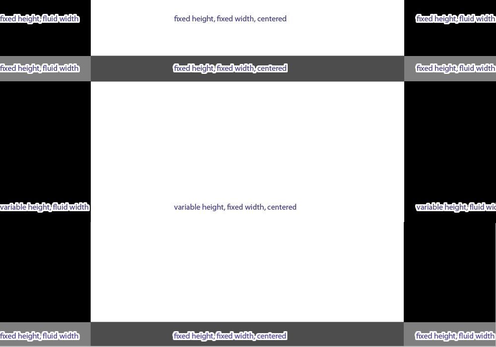
24 This example for a three column layout has a fixed width middle column and two side columns with fluid width. It is very complicated code and is only shown as an example of what can (nearly) be done. I wouldn't use it for a public webpage without further testing and improvement.
The example is based on a challenge to achieve the layout shown in this image. The main content sections in the middle should have fluid height. The footer should stick to the bottom of the page (except in IE6 where it is much more difficult to do).
The principle for the side columns is to make them both width: 50% and to layer a fixed width centralised middle div over the top. The side columns then have inner divs with no stated width but a fixed width margin from the center edge that is the same as the projection from the center of the middle div. This leaves the outer sides fluid.
The floated side divs both have width: 50% and a negative side margin next to the center to drag them towards the center and inner divs with a positive side margin to drag them back again. This leaves space in the middle for the middle div which has float: left to display next to the left div. As position:absolute is not used for the content level side and middle divs which have flexible height it allows the bottom-fixed footer below to know where they stop and to allow a scrollbar if necessary to be able to see all of the content level div which has the most height if the viewport resolution isn't enough to show them both.
The footer has position: fixed so that it is tied to the bottom of the viewport (except in IE6).
The div layout would break down when the side divs become too narrow, so I have added min-width; it works in IE6, IE7, Firefox, Opera, Safari and Google Chrome, a little less reliably in IE6 as IE6 does not operate min-width or position: fixed for the footer tied to bottom of the viewport.
Double margin bug in IE6 and versions before IE6
25 IE6 will double a side margin if there is a float in the same direction (float: left; with margin-left; or float: right; with margin-right;). Adding display: inline; in addition to the float and margin will stop IE6 from doubling the margin. See positioniseverything.net
Notes
See w3.org's Box Model here.
View/Source or View/Page Source in browser menu to see all xhtml code.
The body of this page has margin: 20px. Most divs have border: 1px solid #black and padding: 3px coded in the stylesheet tutorial.css.
The first examples above are in a containing div with width: 730px; and margin: auto; so that they centralise at large screen resolutions.
A lot of codes have been put in html tags in my examples rather than in a stylesheet or in a style in the head. I have done this for the convenience of the viewer so that most (but not all) codes are in one place and the stylesheet does not always have to be viewed in addition. When coding your own page you should try to put as much as possible in a stylesheet and link with id or class to the html tag.
Remember that when a Doctype is included above the head before the html tag (as it should be) then the overall width of a div is its defined width plus borders, margins and padding widths.
If there are differences between Firefox and IE6 that cannot be overcome with one code, code first to get a satisfactory solution in Firefox then create an IF style which will only apply to IE6:-
for instance, if margin-top: 20px; in Firefox needs to be margin-top: 30px; in IE6 then put the following in the head of the html/xhtml page:-
<!--[if ie 6]>
<style type="text/css"> div { margin-top: 30px; } </style>
<![endif]-->
or if there are many different styles, create a separate stylesheet:-
<!--[if ie 6]>
<link rel="stylesheet" href="ie6.css" type="text/css"/>
<![endif]-->
IE6 will contain just the amended styles such as div { margin-top: 30px; } and others (no head or body tags or Doctype).
When looking at a page source for this site you may see code like <p>Little Egret</p> instead of <p>Little Egret</p>. The code < is because in that instance the code is to be displayed on the screen as text. If the < symbol was placed in the code a browser would activate the code and it would not display as text. Such code is not normally required when writing xhtml code tags which are to be activated.
© Wickham 2006 updated 2008
top | prev | next